Colour & Design - Colour Pops
Updated:
Published:
If you’re wanting to dress up your home, without a complete redecoration, colour pops would be the thing to bring your space up. Pairing neutral tones with bright pops of colour is easy with soft furnishings; cushions, throw rugs, even floor rugs and prints.
So what colours are we talking about? Brighter than the soft misty shades of neutrals, we’re seeing bold pastels. Almost the hues of the 1980s, deep apricots and greens, but for 2019, they’re darker and deeper to reflect something a little more earthy than we remember from our childhoods.
Want to take this look to the extreme? Mustard cabinetry, supported by blue prints and details, or deep green. Not sure if you’re ready to take the step? The same rich pastels can be used in feature walls to change up your space, or for a less full-on choice, change up your space with accent chairs in green, yellow or orange. Think earthy apricots, peaches, sage green and peach for a look that will take you into 2020.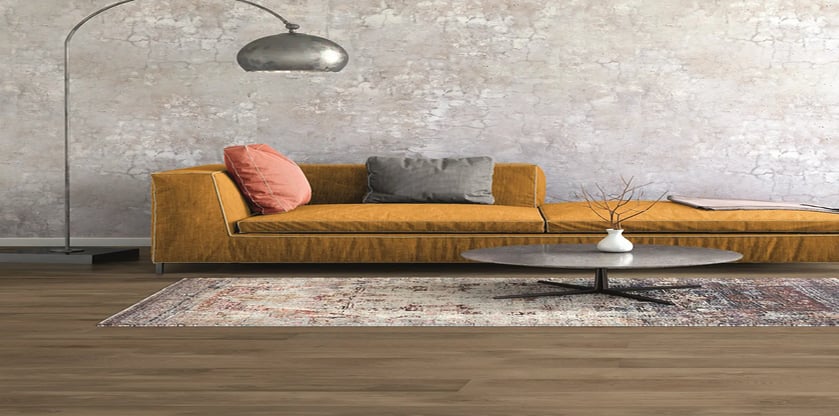
The best part? There’s no problem in mixing and matching your colour pops. Pick complementary or opposing shades, or bring in some of this year’s matt black or gunmetal grey. Don’t be afraid to use different textures either.
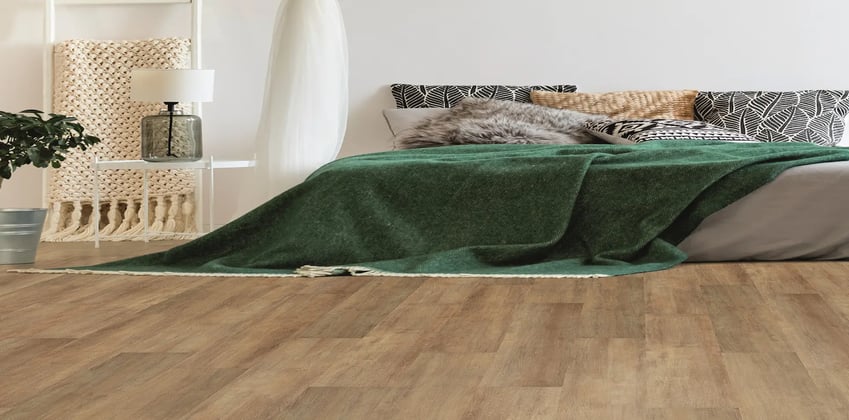
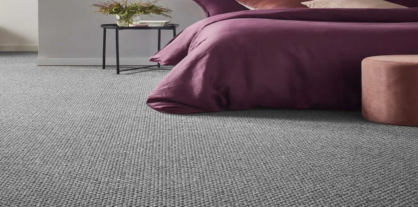
For the foundation of this design trend, look for timber flooring in the living spaces and neutral carpets in the bedrooms. The great thing about this trend is you can go to a deeper, mid-toned floor, you’re not needing to keep things light, which means if there’s a rich Australian timber species you’ve had your heart set on, this is the look that will support it.
Carpet has its own niche. But that doesn't make it less prominent in this year's flooring trends. Carpet is still the most popular option on the market, and like hard surfaces, manufacturers are making huge strides and technological advancements to produce never before seen carpet looks and trends.